
 December 17th, 2020
 4:41 min read
  1289 words
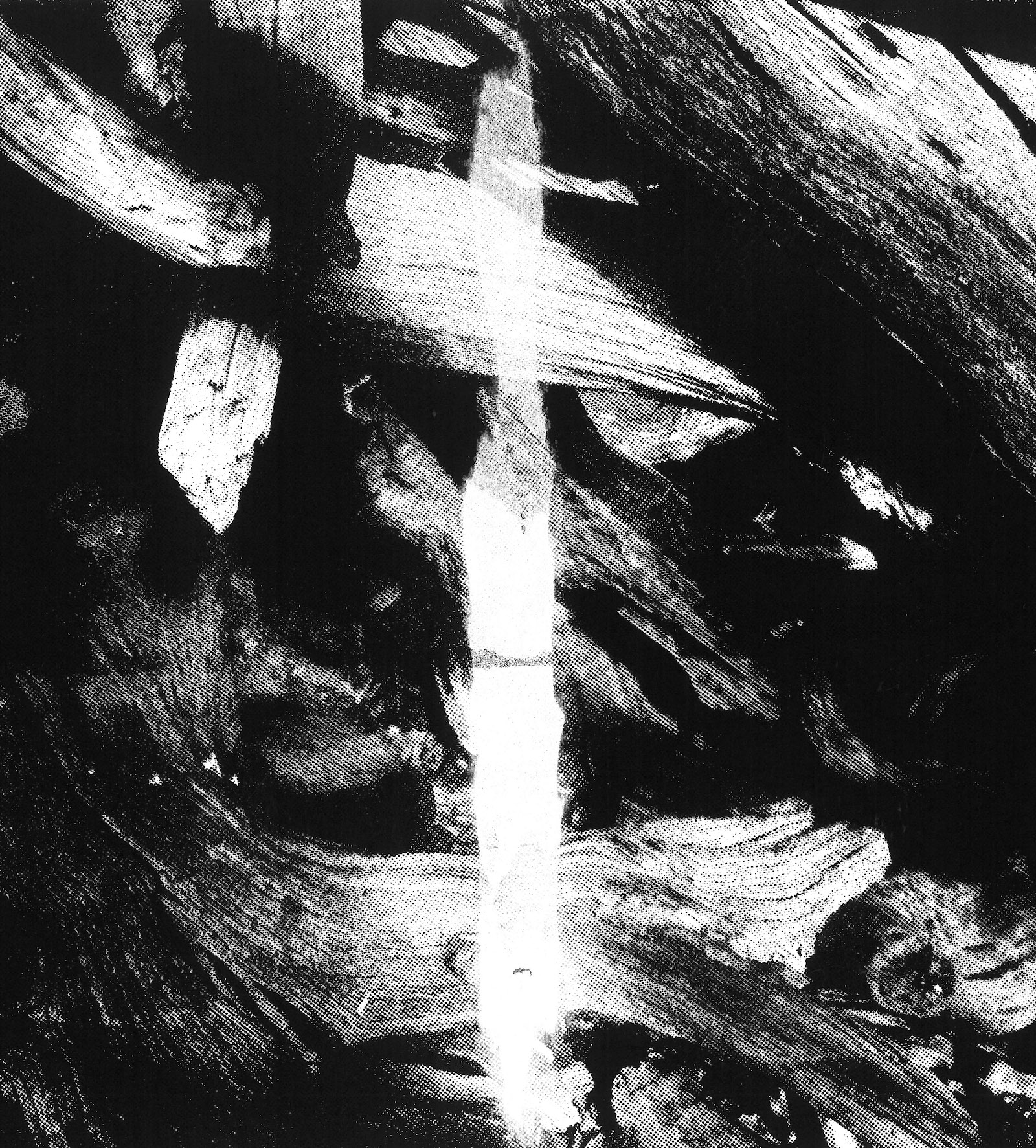
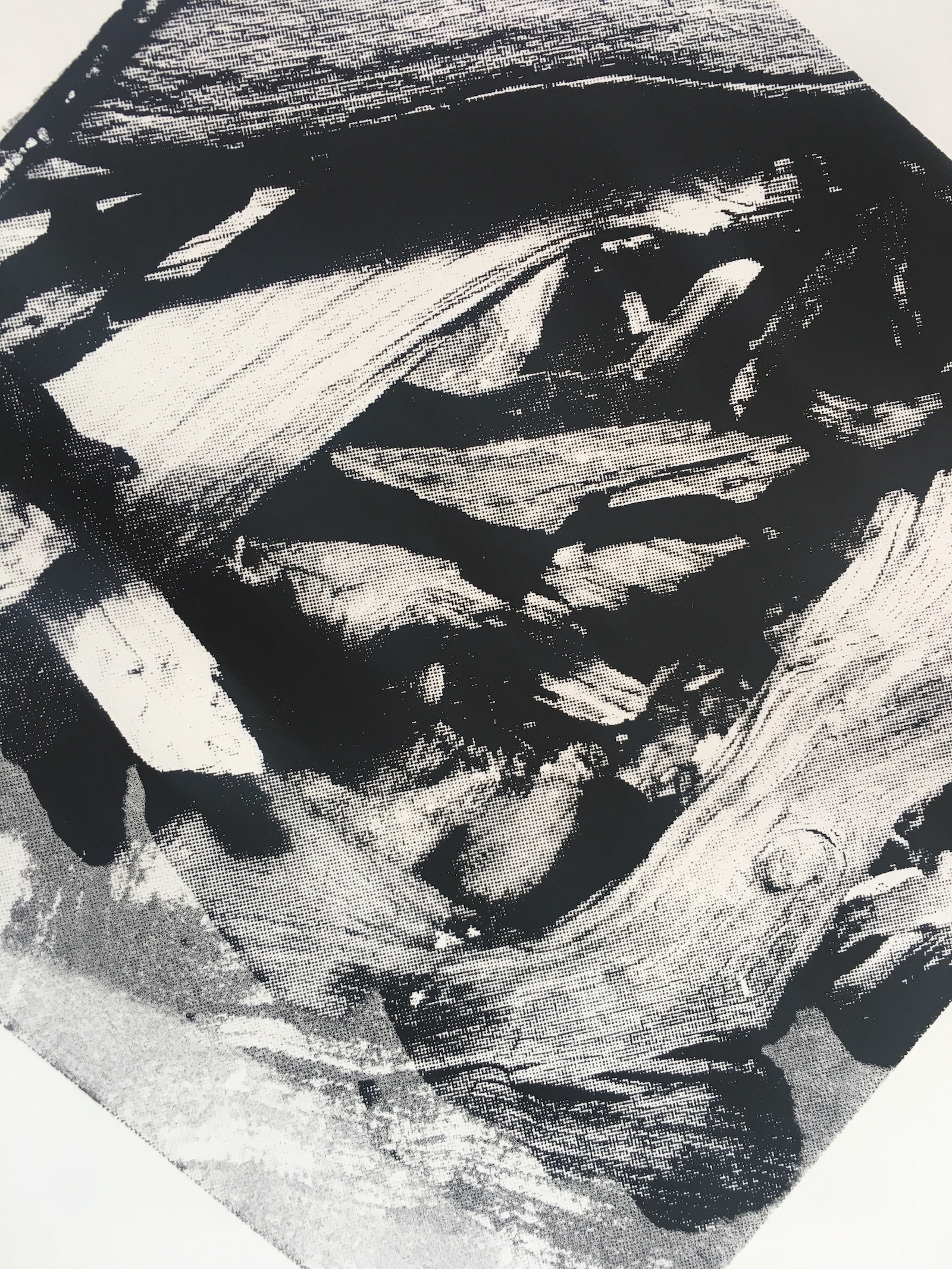
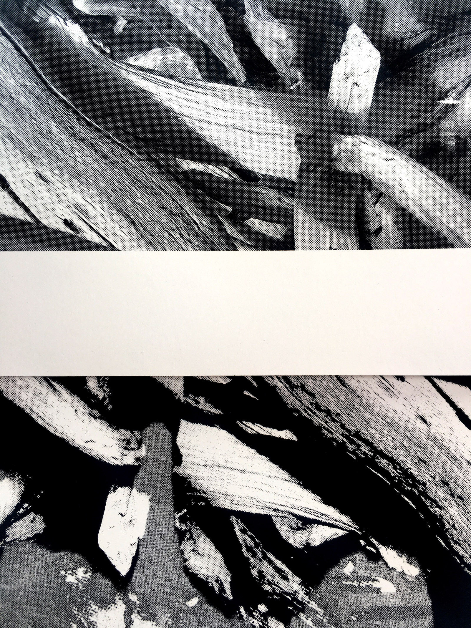
Mesh is an alive membrane through which the light is captured onto the paper. The membrane has the character and qualities embedded in the nature of its materiality.

32 is a challenge.
Despite the fine and fragile texture of screen fabric, the obsession with details and perfectionism is a challenge when the mesh with frequency 32 is employed. It is bold. Striking. With the flavour of Russian Constructivism and texture of Andy Warhol’s pop-art. With this screen, the ink spreads rapidly with the textured noise as sharp as a knife, while elements are lost with the aftertaste of unnecessary ink.

55 is playful.
It has a loud, bold texture in the voice of its predecessor (32). Yet, it often tricks, provides an illusion, a hope to get another grey shade through halftone, promises another detail lost in ink pattern. Once again, it rejects, dances, plays and leaves excess brushstrokes of ink here and there. The screen is as unpredictable as Bruno Munari’s affairs with mediums.

77 is all about the texture.
It transforms the original image into peculiar and beautiful abstractions. Impossible landscapes and horizons grow on the paper through illusive patterns. The process itself is highly compelling. A deformed image is now open for interpretation in its greyness, random patterns, and unintended marks. This would be the perfect screen for the Rorschach test.

Now turn to 140.
It is close to Renaissance’s beloved sfumato. It is delicate and slow. It is predictable as Satie’s Gnossienne. The pace and rhythm play a tender role in its behaviour and response, and thus in the quality of details. This screen reveals its sophistication through symbiosis with patience and time.