

 June 7th, 2023
 4:41 min read
  1289 words
This text is adapted from my MA dissertation, Brutalism, Maximalism and Amateurism of The New Ugly in Chinese Graphic Design. I argued for the historical and cultural significance of the New Ugly [新丑风], a graphic design style populated by Chinese and East Asian designers since the late 2010s. Many works that fall into this style challenge both Western and Chinese design principles while criticising the rapid capitalistic development and its effect on Chinese people.
To contextualise the revolutionary potential of the New Ugly, I wrote this brief overview of Chinese graphic design history, with an emphasis on how Chinese designers incorporate traditional Chinese and imported Western values. Of course, like any piece of writing, this retelling of history is inevitably biassed, so take some grains of salt while reading.
I don’t claim ownership of any of the images used, and they’re only featured here for academic purpose. If you’re the creator or owner of any of the images and do not wish for it to appear on this site, please contact me at azotejr@gmail.com.
Little is written about Chinese graphic design compared to the profound history and discourse of Chinese art that it closely approximates. According to design historian Dr Wendy Siuyi Wong, this could be attributed to a few reasons, such as the lack of foundation studies, the overlooking of the significance of design history, and methodological challenges.1 Additionally, the conventional idea of graphic design as a profession entered China at the beginning of the 20th century, a time of political and social instability. Since then, China has been caught in the painful turbulence of Colonialism, civil and interstate war, natural and artificial catastrophes, and political and ideological upheavals, putting limitations on both the development and documentation of graphic design, amongst others. Amongst these external conflicts is the internal, cultural identity crisis of Chinese people, which is also manifested in the development of Chinese graphic design.
Perhaps the most notable material in the Anglophone world is Chinese Graphic Design in the Twentieth Century 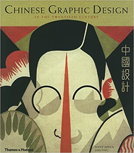 Scott Minick, Jiao Ping. Chinese Graphic Design in the Twentieth Century. 1990. by designer and scholar duo Scott Minick and Jiao Ping, published in London in 1990. Unfortunately, despite the drastic change inside and outside the design world, Chinese graphic design’s subsequent development has received fewer contributions, which remains true, shamefully, in Sinophone and Anglophone discussions. This text seeks to summarise and contextualise how graphic design is situated in the history of China under a limited word count.
The famous Meggs’ History of Graphic Design 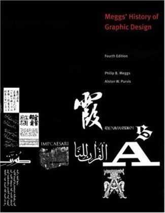 Phillip B. Meggs, Alston W. Purvis. Meggs’ History of Graphic Design [Fourth Edition]. 2006. Despite featuring Chinese characters amongst other writing systems on this cover, Meggs’ is almost exclusively dedicated to Euro-American design history. mentions China mainly because it is the birthplace of some of the first variations of paper making, woodblock printing and movable type printing. Yet, despite China’s potential contribution to the industry’s hardware, influence from China and other regions of the world is barely recognised in the Anglophone discourse. In Meggs’ specifically, there are two chapters dedicated to pre-modern writing and printing traditions worldwide, and the rest are mostly about Euro-American graphic design history. Such textbooks tend to have a limited definition of graphic design as a practice highly entangled with modernism and the Industrial Revolution, and overlook the fact that people all over the world have been ordering, marking, writing, and making for millennia.
In his recent Caps Lock: How Capitalism Took Hold of Graphic Design and How to Escape from It 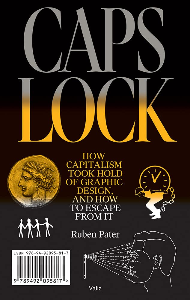 Ruben Pater. Caps Lock: How Capitalism Took Hold of Graphic Design, and How to Escape from It. 2021., Dutch designer Ruben Pater examined the relationship between graphic design and capitalism throughout the history of humankind and stated that ‘financial records are clear examples of early graphic design.’ According to Pater’s research, the oldest message ever found are financial records written on clay tablets by scribes, whom he recognised as one of the earliest forms of graphic designers.
Indeed, what does the job of a graphic designer entail if not organising information, formulating their message, presenting it in an appropriate manner with the material available, and then redistributing the outcome to the target audience? According to Pater’s definition, it can be easily concluded that many artefacts or ephemera, although made premodern and long before the concept of graphic design was formed (certainly before William Dwiggins coined the term), could and should be included in the discussion of graphic design. The practices of printing, calligraphy, type design, book design, pattern and ornament design have existed for a long time—not only in pre-modern China but in most other civilisations before industrialisation—and these practices have a tremendous influence on how designers visualise ideas.
However, this is not to eliminate the significance of graphic design entering China as an alien concept. As we can see throughout the following sections, Chinese designers constantly pursue an ideal equilibrium between foreign and local ideas, no matter their time and space. We should also note that despite the official state doctrine, Chinese culture is not a homogenous whole dominated by the Han people, the illusion of which is the result of incomplete preservation caused by internal and external conflicts.
All in the world know the beauty of the beautiful, and in doing so they have the idea of ugliness; they all know the good, and in doing so they have the idea of what is the bad.
Lao Zi, Dao De Jing
Chinese art traditions are very much based on the concept of harmony. Chinese art and design focus on the negatives of shapes and form just as much as Western design traditions focus on the positives.1 Heavily influenced by interwoven ideas of Daoism, Buddhism, and Confucianism, Chinese art—for the most part—is abstract, symbolic, and conservative. Many noticed that Chinese art tends not to depict graphic horror and violence, unlike the art of Medieval Europe and onwards.1 These art principles such as harmony of elements can be seen as an expression of complacency in the formal realm, a sign of conservative and reactionary ideology. Note that this pattern does not encompass all of Chinese art, but is a dominant phenomena nonetheless which affects Chinese art production to this day. I decided to emphasise this idea, since one of the most important characteristics of the New Ugly is that it is deliberately dissonant, which when examined side-by-side with the pattern of harmony, is indicative of the revolutionary essence of the New Ugly.
Diffused, subtle, elegant—the concept of harmony can be seen manifested in all forms of Chinese art and design: handscroll ink paintings 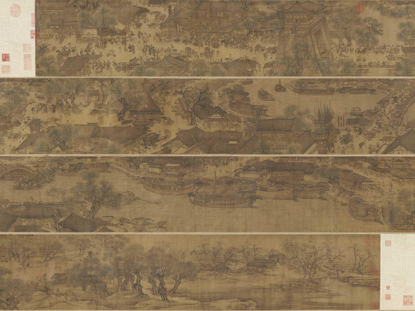 Zhang Zeduan. Along the River During the Qingming Festival [清明上河图]. 1085–1145. This is considered to be the most renowned Chinese painting., calligraphy
  Wang Xizhi [orginal]. Feng Chengsu [copyist]. Preface to the Poems Collected from the Orchid Pavilion [兰亭集序]. Tang Dynasty., name seals
 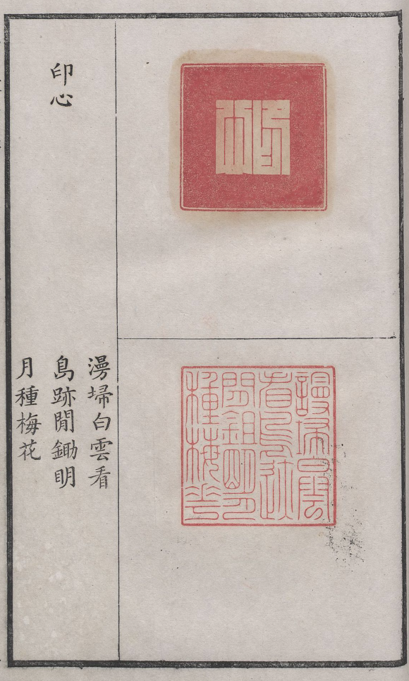 Two seals. Nengerzhai print collection [能尔斋印谱]. Qing Dynasty., and woodcut prints
 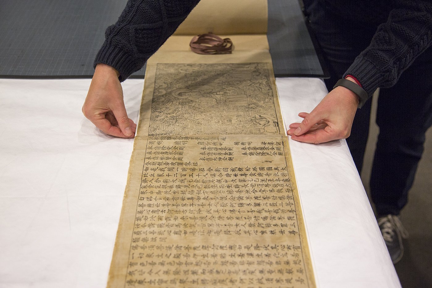 Diamond Sūtra [金刚经]. 868 C.E. Questionably housed at the British Library, this copy is the oldest known printed material., to mention a few. This is not to say that harmony is an intrinsically bad artistic quality, but rather that the long history of harmonious tendency makes the New Ugly even more significant as a rule-breaking innovation and political enunciation. Graphic design, on the other hand, has been entangled with politics since its introduction to modern China, as observed by Minick and Jiao in their Chinese Graphic Design in the Twentieth Century:
Perhaps it was this historical relationship that paved the way for the New Ugly to manifest itself as one of the most interesting design styles in my opinion. As you will see throughout this series, Chinese graphic design is a constant discussion of ideas such as newness, authenticity, Western modernity, and reinvention.
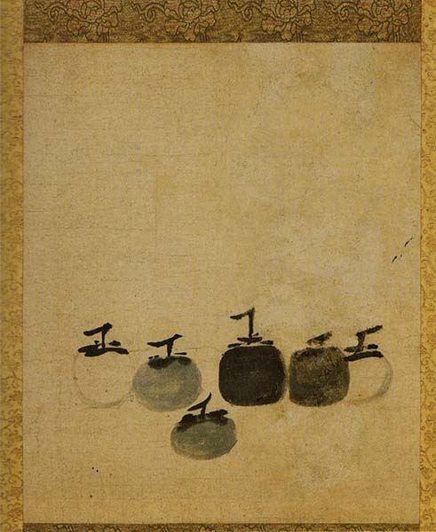
Art represents the thoughts of a period and the ideas of the nation. In other words, it is the outlook of a nation’s spirit. If the spirit changes direction then art will follow the change as well.
Lu Xun, On Opening Our Eyes And See
Following its defeat in the First Sino-Japanese War, the Qing government and later Republican China began a modernisation process that included sending its best art and design talents to receive Western or Japanese education. After centuries of isolationist policies, Minguo’s young Chinese criticised traditional Confucian values and proposed a progressive reform of culture heavily inspired by Western ideas. The radical, anti-traditionalist New Cultural Movement of the 1910-20s was both the cause and result of general confusion and disorientation, thus the Shanghai Modernists emerged in an attempt to form the young country’s new identity.1
Lu Xun, a medical student turned writer and designer, is one of the founding figures of the movement.1 As a great admirer of Western printmaking techniques and a believer in traditional Chinese aesthetics, Lu encouraged his peers and younger generations of designers to look for inspiration from Chinese folk art patterns 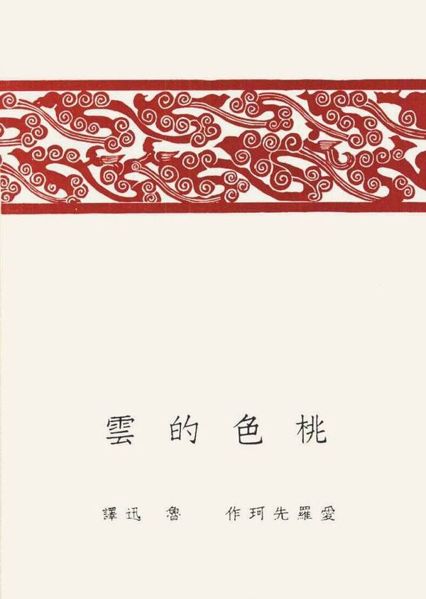 Lu Xun. The Pink Cloud [桃色的云] cover design. 1923. in order to incorporate them with Western techniques
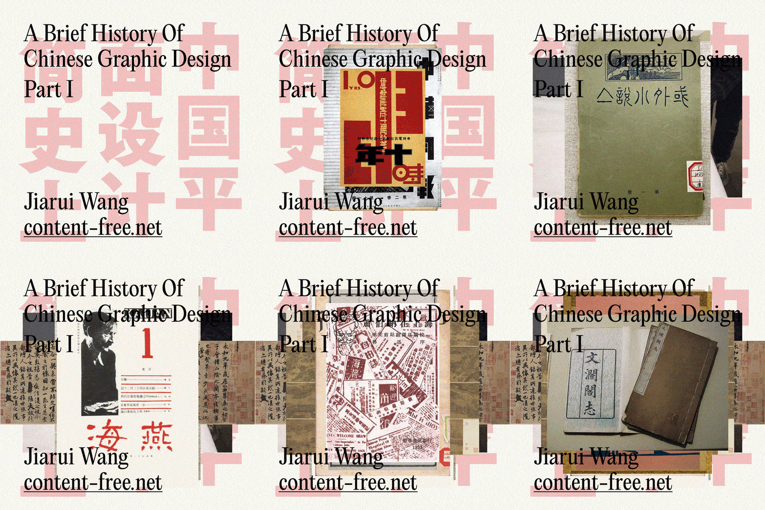
 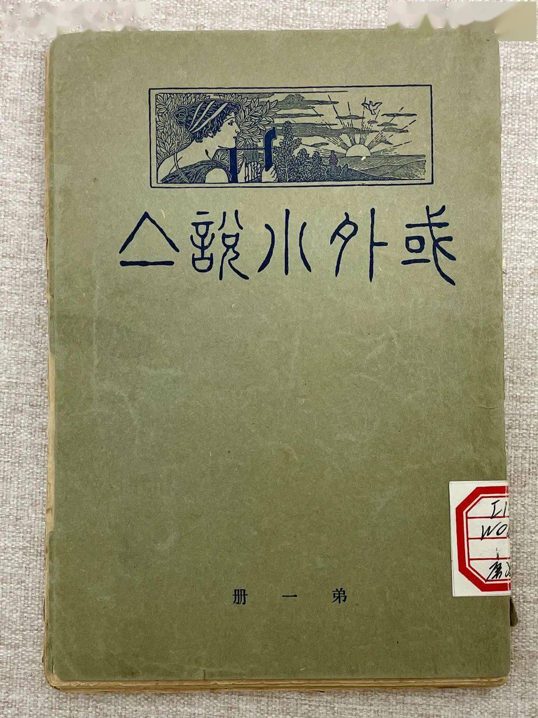 Lu Xun. Selection of Foreign Fiction [域外小说集] cover design. 1909. This is known to be Lu’s first cover design, made for the book he translated with his brother..1 Many of the first design organisations and schools established during these formative years followed this idea of not blindly imitating Western styles but focusing on meditating on a modernised China.1
Following Lu’s idea of assimilation, young practitioners such as Qian Juntao [钱君匋], Tao Yuanqing [陶元庆], and Chen Zhifo [陈之佛] revolutionised book cover design in China. Before the Republic, books were simply stitch-bound with the title written calligraphically on a plain cover 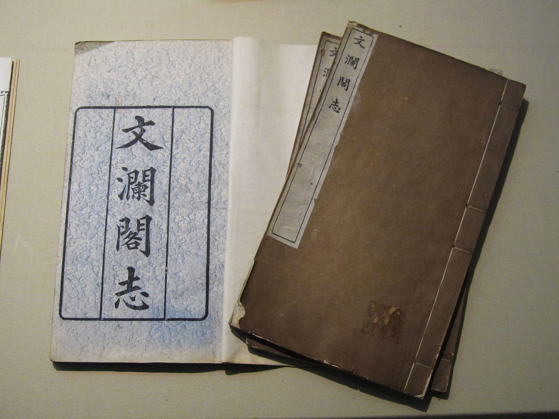 Copies of Records of Wenlan Pavilion [文澜阁志]. Qing Dynasty. This is an example of a typical Chinese book design of its time.. In contrast, the Shanghai Modernists created naturalistic and organic patterns and illustrations for the covers. Mentors of these designers are either of Japanese or Western origins or have received education overseas and had similar beliefs as Lu. And indeed, the Shanghai Modernists’ works usually show their Chinese heritage such as images referencing ancient cave drawings
 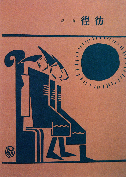 Tao Yuanqing. Wandering [彷徨] cover design. 1929., bronze patterns
 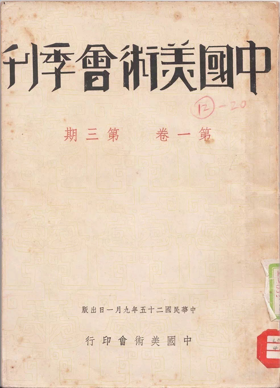 Chen Zhifo. China Art Society Quarterly cover design. 1936. Note the subtle use of bronze patterns in the background., seal carving
 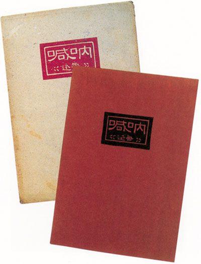 Lu Xun. Call to Arms [呐喊] cover design. 1926., and calligraphy
 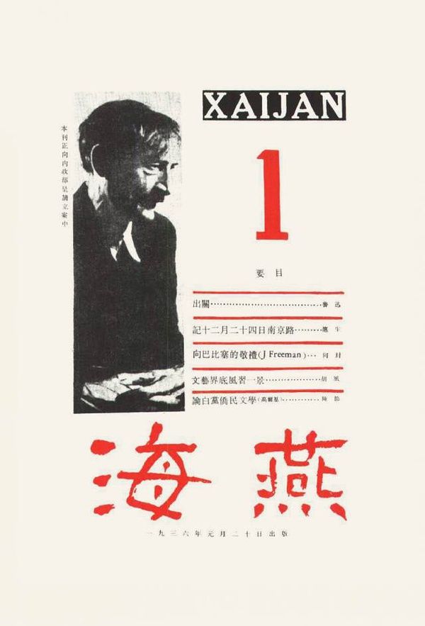 Lu Xun. Petrel [海燕] magazine cover design. 1936. in combination with Western stylistic influences such as formal characteristics of Dadaism
 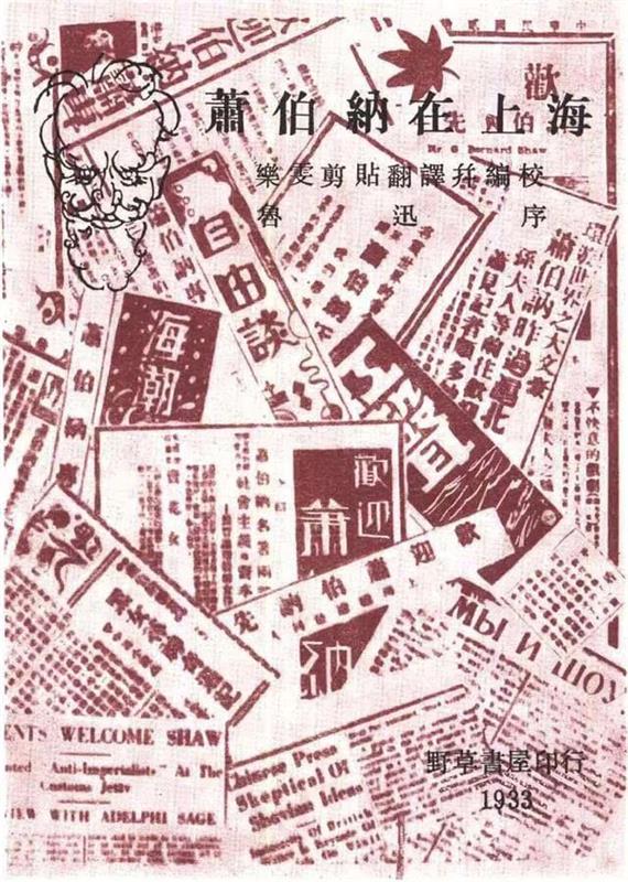 Lu Xun. George Bernard Shaw in Shanghai cover design. 1933., and Constructivism
 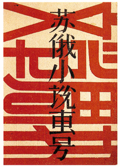 Qian Juntao. Literature Weekly cover design. 1929. This is an issue on Russian fiction..1 A diversity of magazines were established during this time, presented in the new Shanghai style while embracing a mix of literature, art, philosophy, education, politics and culture, such as La Jeunesse [新青年], Modern Student [现代学生], and The Ark [方舟].
Because of increased cultural movements locally and globally, Chinese people’s need for political self-determination and technological modernisation upsurged during the 1930s. Designers aspired to Western mathematics and geometry, the idea of rationality and logic they embodied, as well as Russian Constructivism and the progressiveness it represented. Graphic design from this Progressive Movement, is formally characterised by geometric shapes, abstract symbols 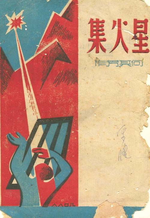 Sparks[星火集] cover design, 1945., flat colour planes
 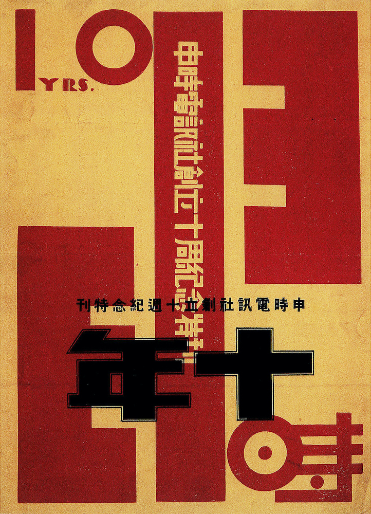 Qian Juntao. Ten years on Shenshi Telegraphic Dispatch Agency poster. 1930., mechanical and industrial motifs
 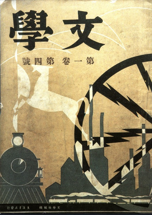 Chen Zhifo. Literature cover design. 1933., and notably, modern typographic experimentations
 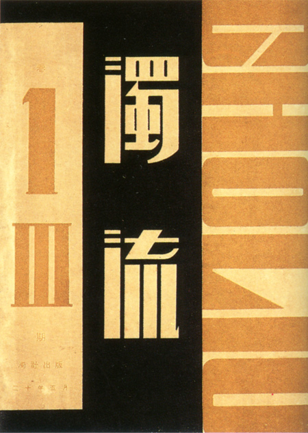 Qian Juntao. The Muddy Stream [浊流] cover design. 1931. and the use of dynamic photography
 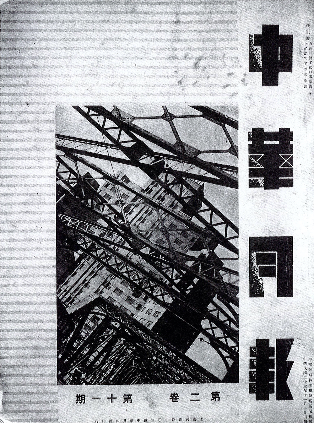 The Central China Monthly cover design. 1934..1
Unfortunately, many design activities were halted, and the Shanghai Modernist and Progressive movement scenes were cut off in 1937 due to the Japanese invasion. The invasion led to the Second Sino-Japanese War, after which the post-war effect and communist disfavour of ‘capitalist print culture’ set back the development of graphic design as a profession in mainland China for years.1 However, the commercial Shanghai style design continued to thrive under British-Colonial Hong Kong’s capitalist economic system.1
Soon, the change of Regime would transform everything in modern China, including graphic design. To continue reading about graphic design history after the founding of the People’s Republic of China, please go to A Brief History of Chinese Graphic Design (Part 2).
