 June 7th, 2023
4:41 min read 1289 words
June 7th, 2023
4:41 min read 1289 words
To read the first half of this article, please go to A Brief History of Chinese Graphic Design (Part 1).
This text is adapted from my MA dissertation, Brutalism, Maximalism and Amateurism of The New Ugly in Chinese Graphic Design. I argued for the historical and cultural significance of the New Ugly [新丑风], after writing this brief overview of Chinese graphic design history.
I don’t claim ownership of any of the images cited, and they’re only featured here for academic purpose. If you’re the creator or owner of any of the images and do not wish for it to appear on this site, please contact me at azotejr@gmail.com.
There is in fact no such thing as art for art’s sake, art that stands above classes, art that is detached from or independent from politics.
Mao Zedong, Talks at the Yan’an Forum on Literature and Art
After the Communist Party of China (CPC) took over the country in 1949, leader Mao Zedong recognised the instrumental value of art, craft and design in economic development and ideological formation. In his ‘Talks at the Yan’an Forum on Literature and Art’ in May 1942, he criticised the art of the past for only serving the ruling class and bourgeois. In Mao’s vision, the new revolutionary art and design should be by and for the proletariat and should prioritise serving political purposes. The idea of political art is nothing new. However, Mao’s extremely progressive attitude meant that those not up to his standard were doomed:
The first generation of workers of the People’s Republic of China, in their thirties or forties during this time, experienced the hardship in the past and therefore excitement of the formation of a new nation.1 However, the new regime did not allow too much enthusiasm of the workers to be imputed: the only valid forms of graphic design were publication design 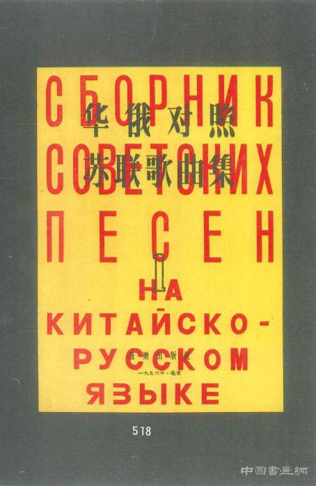 Qian Juntao. Cover design for Chinese-Russian USSR Song Anthology. 1956. You can refer back to Part 1 for Qian’s work from the 1930s to compare., advertising
 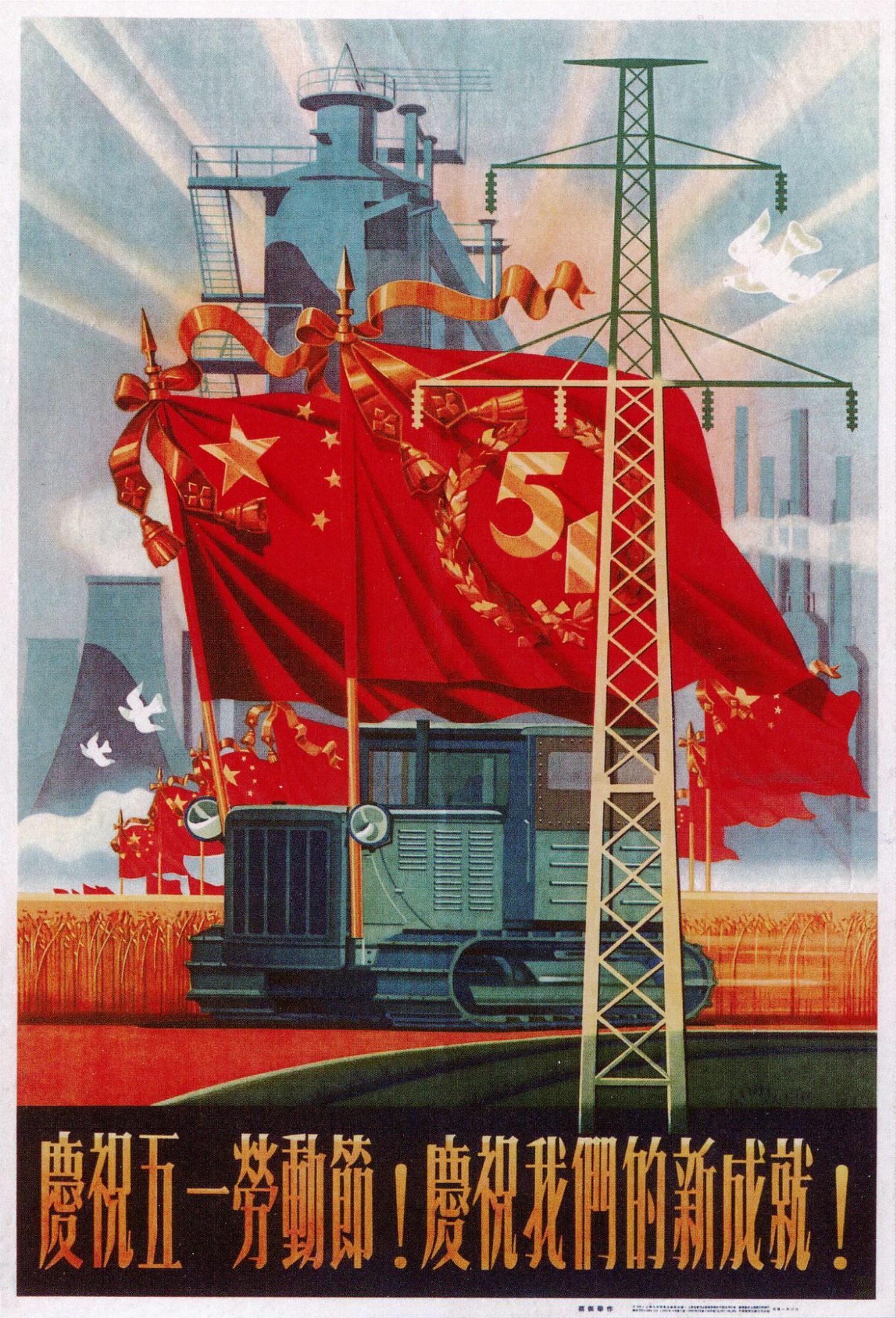 Former commercial designer Cai Zhenhua. International Labour Day Poster. Shanghai. 1955. The bottom text reads: ‘Celebrate the May 1st Labour Day! Celebrate our new accomplishments!’, both served mainly propaganda purposes, and some form of packaging design.1 Former art workers, designers or managers of design agencies noted that around 70% of their work from the 1950s to 1960s was political, and a striking 100% during the Cultural Revolution, many of which did not allow creative freedom at all, since the posters were already finalised by official publishing houses, and the job of the agencies was to merely copy the design onto billboards. Commercial graphics are considered part of ‘Western lifestyle’ and they encourage ‘unnecessary purchasing and waste of national resources.’ Packaging also remained very simple, since the tradition of premodern packaging in China was to merely wrap the product in paper and strings.1
Whilst early USSR propaganda was heavily influenced by Russian Avant-Garde designers like Alexander Rodchenko and El Lissitzky, propaganda art under CPC looked at visual Socialist Realism as its predecessor, while also seeking references from other origins: In order to reach a less literate rural population that mainly worked in agriculture, the formal aesthetic of the revolutionary style drew inspiration from Chinese folk art, such as papercuts 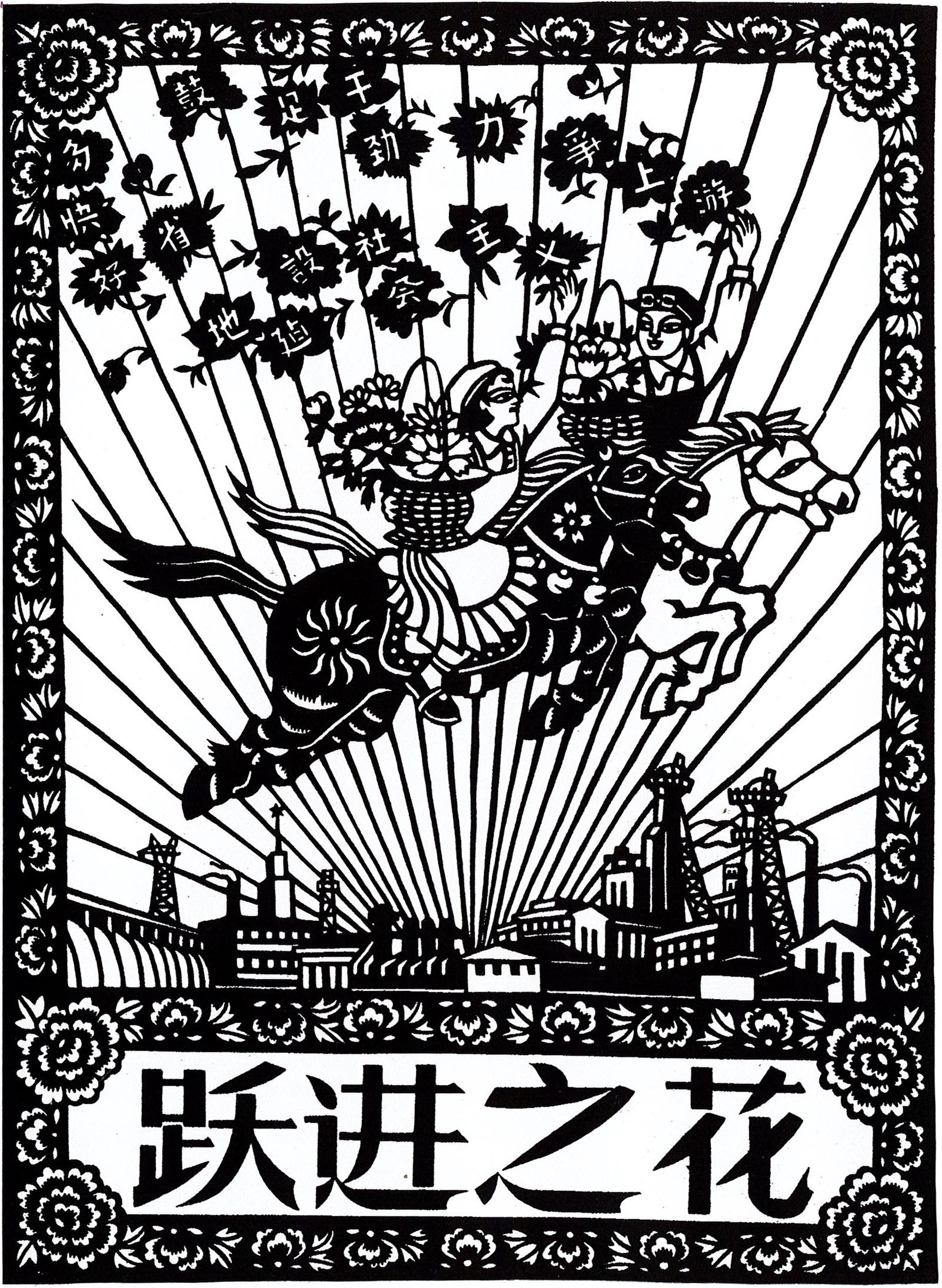 Zhuang Ping & Zhang Heming. The Flowers of the Great Leap poster. 1958. and painting techniques of non-Han, ethnic minority art
 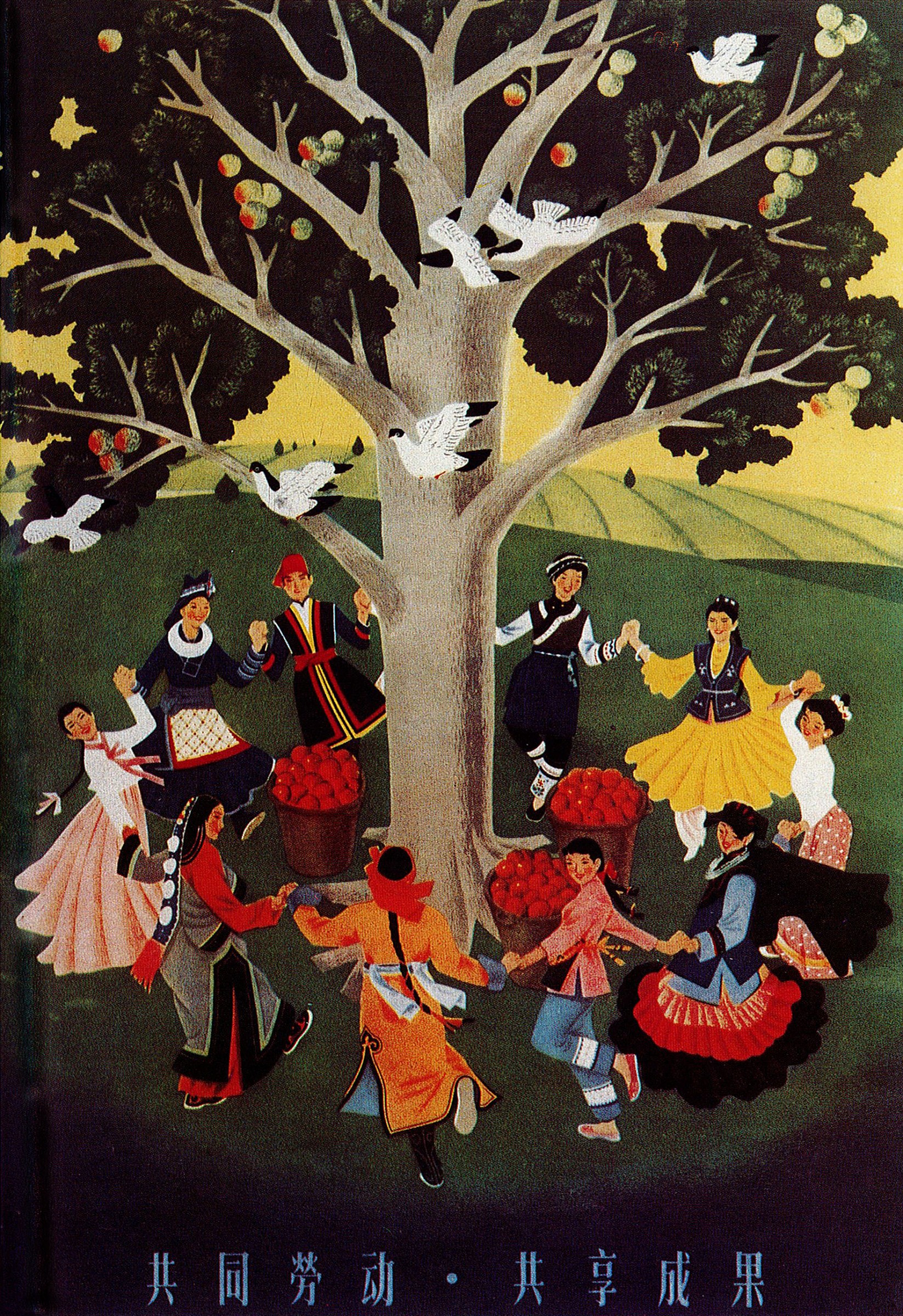 Cai Zhenhua. Share the Labour and Share the Fruit poster. 1957.. Thematically, the images focused on the struggle and plight of the Chinese proletariat in rural settings in hopes of inspiring them to fight for change
 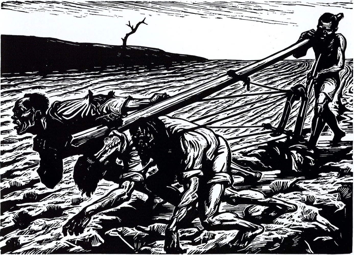 Li Hua. Struggling to Survive. Woodcut. 1947.. Mao also endorsed Lu Xun’s idea of vernacularism and preference for woodcut printing. Woodblock was affordable, portable, easily concealed during the Japanese invasion, and made mass production easy. Its production process also led to bold and rough textures that highlighted the laborious hardship of workers
 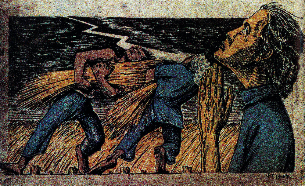 The World. 1947..1
The new Yan’an artistic ideal differed significantly from the aforementioned Shanghai style, which was reasonably less popular amongst the CPC art commissions. Suggestions have been made to approve ‘a hybrid style which would merge the ideological strength of Yan’an with the technical and visual advances of the Shanghai-style.’ However, the 1950 Korean War put a stop to the hybrid proposal as all foreign materials and ideas are prohibited from entering China.1 Because of the absence of Western influence and the subsequent Great Leap Forward, propaganda art showed an increased inclination towards Soviet Socialist Realism, and the subject matter usually involves unity, representation, production, and advancement in an optimistic light 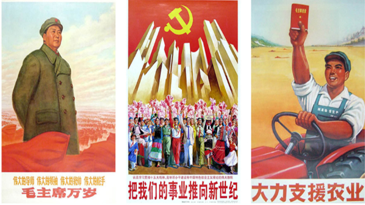 Three posters. Propaganda Poster Art Centre. Shanghai. The titles read [from left to right]: ‘long-live Chairman Mao,’ ‘push forward our cause to the new century,’ and ‘greatly support agriculture.’.1
During the Cultural Revolution of 1966-1976, schools and universities were closed and many professors were sent to the rural area to be reeducated, hindering the education of those who had just come of age at the beginning of the revolution. Students during this decade were thus known as the lost generation of PRC. Fearful, overwhelmed individuals had little freedom to produce art or design that was not pro-CPC.1 Propaganda art, on the other hand, shifted to a more optimistic tone, usually with happy and muscular workers looking into their bright future, or surrounding their red sun, Mao 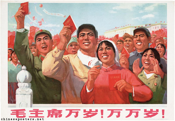 Shanghai Fine Arts Academy Work Propaganda Team, Revolutionary Committee [上海市美术学校工宣队革委会]. ‘Long live Chairman Mao! Long, long live!’ poster. 1970.. The archetype of the propaganda poster is one with a Socialist-Realistic illustration on the top, and underneath it, a slogan set in a usually elongated typeface, either vertically or horizontally.
Mao’s life, along with the Cultural Revolution, ended abruptly in 1976. However, the effect of propaganda art did not stop here:
The overall idea of utility over beauty also continues to affect the life of Chinese people generation after generation. In their article, Chinese Journalist Shell Long notes that many structures that followed the Communist aesthetic, whilst symbolising monumental expectations of China as a strong industrial country, almost only focused on their utilitarian and public aspect. Structures were brutally simple with little to no decoration, and infrastructure like water taps were only communal and not private. Long writes, ‘since when we were little, teachers and even parents constantly indoctrinate us with [the idea of utilitarianism], just as the fable “The Ant and the Grasshopper”—hardworking is the only way to life, and those who shamefully pursue art and beauty deserve to starve.’1 Elements of homogeneity, repetition and monumental aspirations manifest in graphic design in a similar way, and we can still see the influence of Maoist aesthetics and ideology in the daily life of Chinese people. This also corresponds with the contemporary resurgence of propaganda messages all over the country, especially those in rural and underdeveloped areas 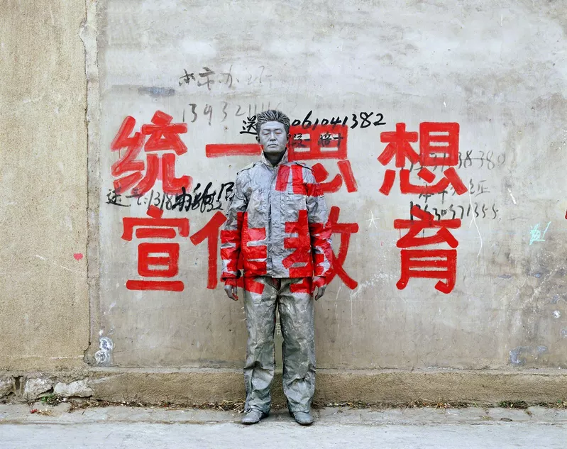 Liu Bolin [刘勃麟]. Hiding in the City [No.36]. 2006. Using his own body as a canvas, Liu paints himself into his surroundings. This series focuses on propaganda slogans that are frequently seen in rural areas. The slogan reads, ‘Unite ideology. Promote education.’.
We want political democracy! We want artistic freedom!
The Stars Exhibition
In a 1982 Creative Review article, packaging designer Robert Williamson shared his experience of being invited to Shanghai to lecture on local designers. He deemed Chinese packaging design to be ‘too fussy for [British] market with an obsession to red and gold.’1 This is an interesting insight into the early 80s design scene, since Williamson obviously had not taken into account the recent history of China and how it affected Chinese people. As stated in the last section, less than a decade before his visit, Chinese package designs were still minimal, archaic, and mostly existing for protection for exporting. The ‘obsession to red and gold’ is mostly probably remnants of Maoist aesthetics. Concepts like corporate identity design were ‘unheard of,’ since state media was the only thing accessible to the public.1 After Mao’s death, then-Chairman Deng Xiaoping implemented his ‘Reform and Opening Up’ policy to reconstruct the economy. The policy aimed to shift China away from a state-dictated economy and allowed foreign businesses to invest in China, providing opportunities for designers to rehabilitate themselves from decades of centralised governmental media:
Universities and schools started to open up as well after the end of the Cultural Revolution, and students, especially those in art and design, were sent abroad to study again for the potential economic value.1 The sudden influx of new culture, ideas, and design theories created great confusion for the small number of designers of the late 70s, who resorted to copying any imported design despite its aesthetic quality.1 The 80s and early 90s bred many stylistic norms: the abstract and flat ‘interpretive illustrations’ as an reaction to the hyperrealism of the Cultural Revolution 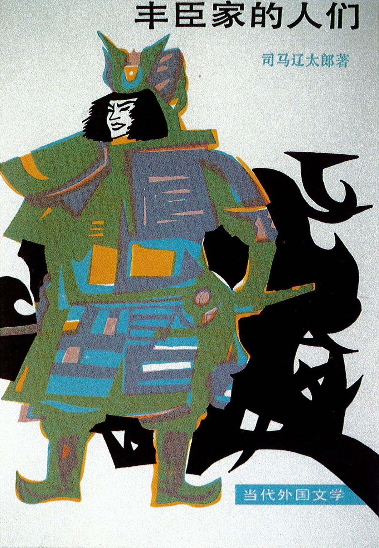 Qin Long. Members of the Toyotomi Family cover design. 1988; the conceptual images as the result of increasing awareness of environmental issue and religious freedom
 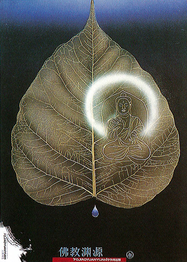 Liu Yan. The Origins of Buddhism poster design. 1989.; The New Wave which interprets traditional images with cheap but new tools
 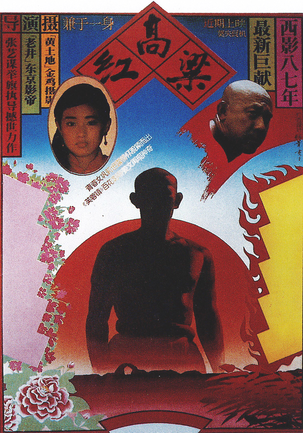 Chen Shaohua [陈绍华]. Red Sorghum film poster. 1987.; and the modern folk revival that returns to Lu Xun’s recognition of taking inspiration from China’s visual traditions
 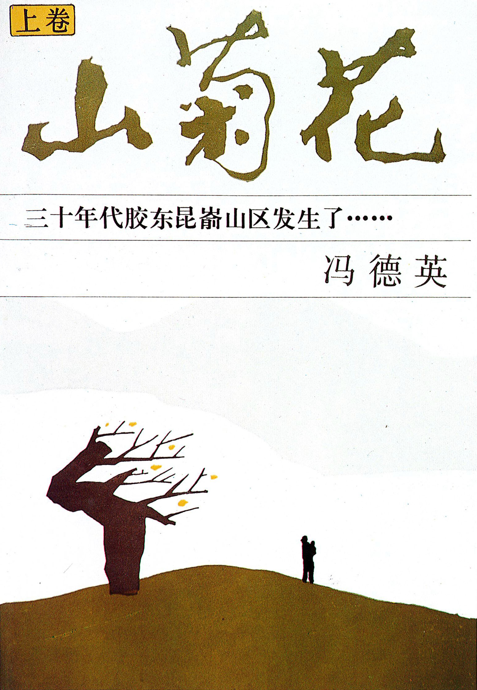 Lu Zhengwei. Mountain Chrysanthemum cover design. 1986..1
With consumer market growth after ‘Opening Up’, the demand for advertising, corporate identity design, packaging design, design agencies and studios, as well as in-house design departments of big corporations, emerged accordingly. Posters surfaced as the most studied area of graphic design, possibly due to their commercial use before PRC and political significance during Mao’s era. Propaganda posters are still produced, but by the late 80s and 90s they were no longer the main channel of political communication.1 The growth of the industry is also reflected in printed matters: magazines focused on design, such as Applied Arts, Chinese Journal of Design, and Design Exchange were established. As political censorship declined, these magazines also allowed designers to access international art and design news.
The relative commercial and political freedom rippled across fields of fine art and design. Underground artist societies formed and held avant-garde art exhibits 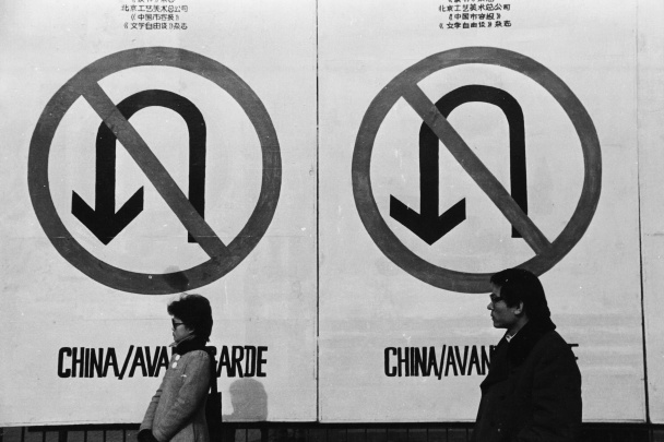 Wang Youshen. Photograph at the most important exhibition of Chinese contemporary art, China/Avant-Garde, the poster of which features a large ‘No U-turn’ sign. Beijing. 1989.. These movements signalled a new wave of Chinese art that was ‘neither western modern nor historic Chinese,’ and their legacy remains today in spirit and in form
 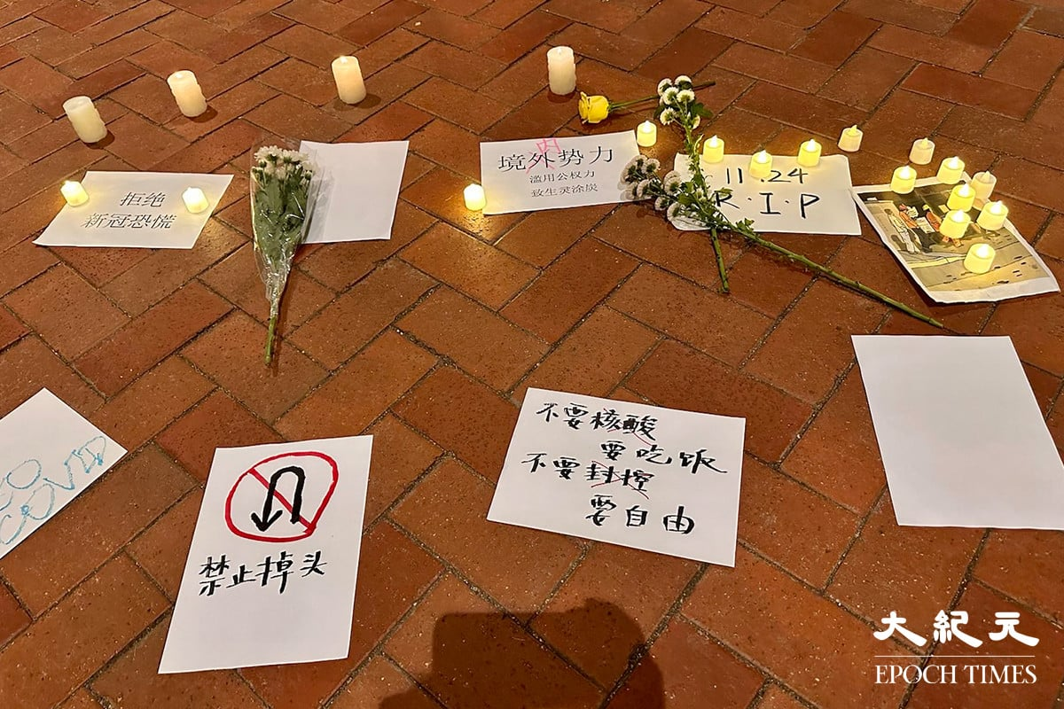 In a candlelight vigil in memory of the 2022 Ürümuqi fire, a participant put up a ‘No U-turn’ sign, an icon occasionally seen in situations with anti-CPC sentiment, and a warning to not repeat the tragedies of the past. Hong Kong. 2022..1 However, Chinese people’s pursuit of freedom was met with much state oppression: many progressive art exhibitions were shut down by police, and the waves of student movement advocating for democracy concluded with the carnage of 1989.
Contemporary Chinese graphic design embarked mostly in Shenzhen because of its geographical and cultural proximity to Hong Kong, which had more access to knowledge of contemporary Western design. Proximity to Hong Kong also meant more access to business opportunities with the West at the time, benefiting as well from the territory’s Special Economic Zone status. Famous Hong Kong designers like Kan Tai-Keung [靳埭强] and Wucius Wong [王无邪] among others visited the Guangzhou Academy of Arts to teach Western design fundamentals, such as Bauhaus theory. The first graphic design exhibition, Graphic Design in China (GDC) 1992 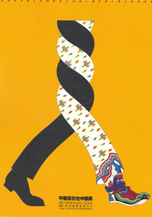 Chen Shaohua. Graphic Design in China poster. 1992. The intertwined legs with respective Western and traditional Chinese attire form a gestalt that resembles the Chinese character for people [人], symbolising the first GDC exhibition’s theme: combining Eastern tradition and Western modernity., was also held in Shenzhen, settling down the use of Pingmian Sheji [平面设计] as the official Chinese translation of ‘graphic design’, and leading to the founding of the Shenzhen Graphic Design Association (SGDA), the first nonprofit professional organisation on graphic design in China.1 Organisations like the SGDA are crucial to stimulating the local design industry as well as building international connections, which is why southern, Open Coastal cities like Shanghai and Ningbo paralleled this trajectory of hosting design exhibitions and establishing organisations in the industry.1
This influx of foreign culture and the tendency to seek international recognition means that the mix between Chinese and foreign ideas remained one of the more prominent themes of this period. Many turned to Japan as an example of ‘an economically advanced and technologically sophisticated country capable of sustaining a complex cultural identity.’1 Designers juxtaposed Chinese and Western elements, techniques, illustrations and hanzi to reflect this encounter of the newly globalised period  Kan Tai-Keung. Poster design for a private graphic design course. 1977. Kan showed two characters of the name of the course respectively with clean, constructive lines borrowed from Western type design and Chinese calligraphy..
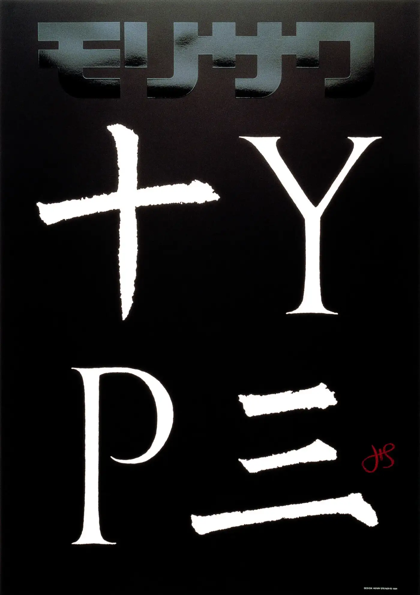
This dichotomy of Eastern and Western ideas is especially compelling when it comes to the discussion of the design scene in Hong Kong  Henry Steiner [石汉瑞]. Cover design for Hong Kong Mass Transit Railway’s 10th-anniversary annual report. 1989. The capital letter ‘T’ in the word ‘ten’ is replaced with the Chinese character, ‘十’, which also means ‘ten’.. However, it is important to note that the clichéd claim of ‘East meets West’ often ignores the effect of colonialism in its multitude of forms, especially in Hong Kong. Graphic design by Western designers that fall into this category of juxtaposing elements from two cultures, although commercially successful, need to be examined and critiqued under a broader cultural context. Some of the analogies lack critical reasoning, historical consciousness, and cultural considerations. More importantly, the Shanghai Modernists and their aforementioned Hong Kong successors had already started exploring the idea of ‘East meets West’ decades ago, but they weren’t given enough academic attention and credit compared to their Western counterparts. Many of these works were designed for corporations established by British traders during the 19th century.1 The introduction of Western ideas and design is crucial to the Chinese and Hong Kong graphic design scene, but we should understand that ideas and culture no longer flow unidirectionally in our highly globalised world.
Anything can design. Anyone can be a designer. The widespread of technology has broken the blockade of professionalism, so the creative field of design could reach true democracy.
Ou Ning, Get it Louder Exhibition
In 2008, London’s Victoria and Albert Museum published China Design Now to coincide with the exhibition of the same name. The book acknowledged the profound economic, cultural, and creative impact China has achieved since Deng’s reform, with emphasis on Beijing, Shanghai and Shenzhen, three of the largest cities in the country. The V&A exhibition is certainly not the whole picture and only a sign of the rise of Chinese designers’ international success.1
If it was hard to summarise the general design characteristics of any of the previous eras, it is certainly impossible to encapsulate what design looks like in a postmodern society of the most populous country in the world, especially with the exponential technological advances that allow design to become a much more individualistic practice. However, aforementioned patterns such as the use of posters, exploration of the Chinese writing system, and the mix of Chinese and Western ideas, continued evolving.
The popularity of poster as a medium has sustained and flourished, perhaps more than ever. It also differentiates itself from the conventional commercial poster, striking a unique balance between aesthetics and design-thinking:
Although posters seem to have their own nuanced connotations for Chinese designers, as Zhang notices, ‘The medium of the poster was effective because it is the lingua franca spoken by the international design community.’ These posters continued to bring international attention through exhibitions and biennales organised by graphic design associations.1
The discussion of posters in Chinese graphic design cannot depart from the use of hanzi as a crucial design element. Explorations of the form of hanzi continued in the 2000s following the previous interpretation  Hei Yiyang [黑一烊]. I love Chinese Characters poster. 2003. Hei formed the character meaning ‘to learn’ [学] with wooden Tetris pieces., juxtaposition
 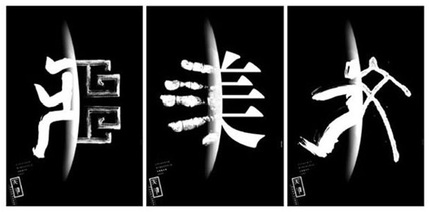 Jiaying Han [韩家英]. Posters for Frontiers magazine. These are juxtapositions of the same character in different scripts from various time periods, rendered with different medium. 1997., and deconstruction
 ![]() Wang Xu [王序]. Hiroshima poster for the 60th anniversary of Atomic Bombing. 2005. Wang wrote ‘Hiroshima’ [广岛] in simplified Chinese, while intentionally leaving out strokes to evoke ruins and loss. of Chinese characters. Designers were able to experiment freely on top of the inherent semantic richness of the hanzi as pictograms, ideograms or a combination of both, and the long history of traditional calligraphy. An internationally famous designer based in Berlin and Hangzhou, Jianping He [何见平] is known for his creative incorporation of materiality in the digital age
Wang Xu [王序]. Hiroshima poster for the 60th anniversary of Atomic Bombing. 2005. Wang wrote ‘Hiroshima’ [广岛] in simplified Chinese, while intentionally leaving out strokes to evoke ruins and loss. of Chinese characters. Designers were able to experiment freely on top of the inherent semantic richness of the hanzi as pictograms, ideograms or a combination of both, and the long history of traditional calligraphy. An internationally famous designer based in Berlin and Hangzhou, Jianping He [何见平] is known for his creative incorporation of materiality in the digital age 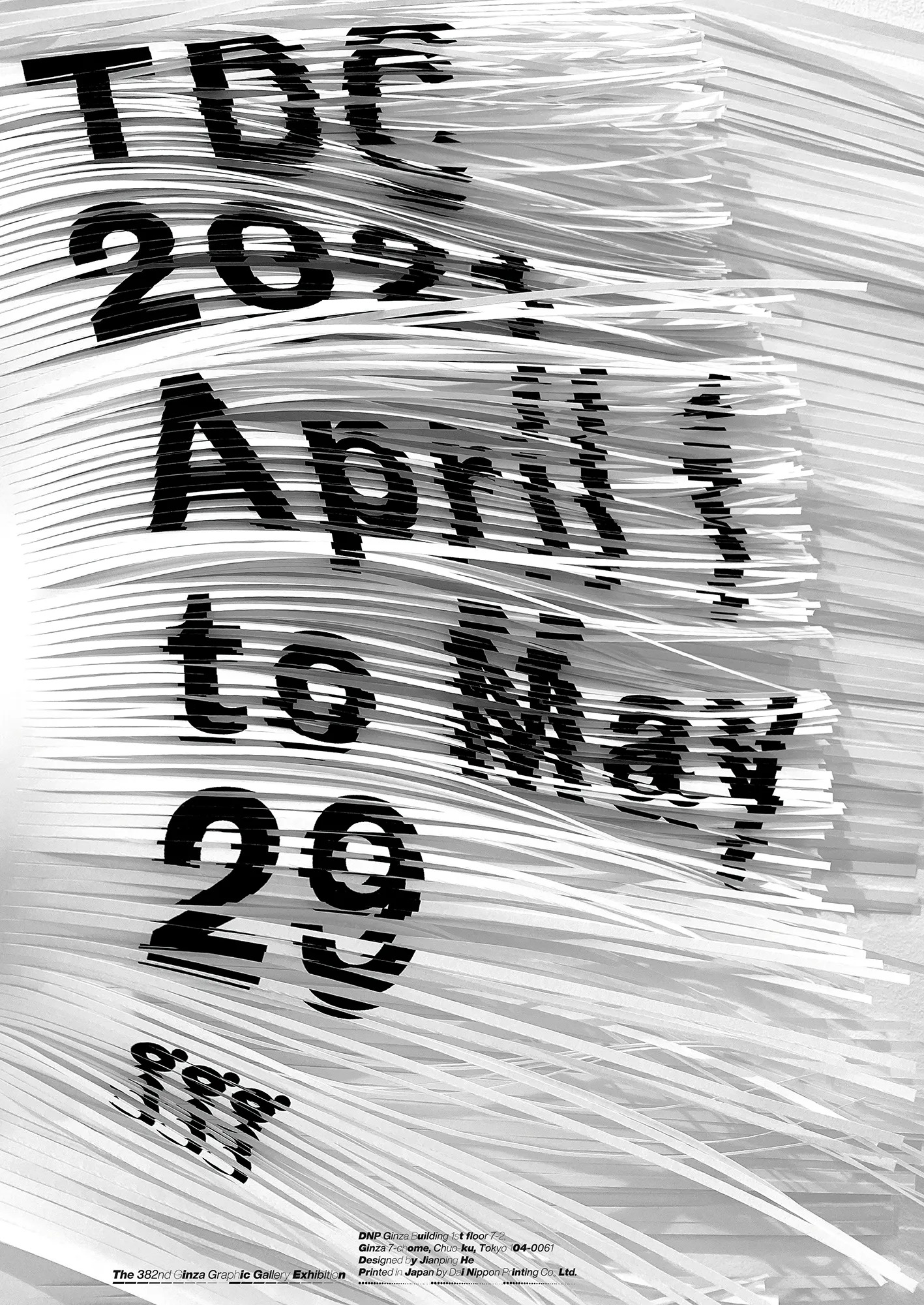 Jianping He. Poster for Tokyo TDC Annual Awards Exhibition. 2021.. He has done many posters that explored the idea of Chinese characters as both the thematic
 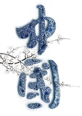 Jianping He. China Image poster. 2004. Made for a Taiwanese poster exhibition, this poster features a calligraphic design of the word ‘China’ [中國] in traditional characters, made with painted ceramic and an image of peach blossoms to symbolise Taiwan. and stylistic element
 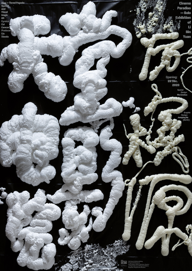 Jianping He. Exhibition poster for Cinema Paradiso, a solo exhibition of Chinese artist Li Bin Yuan. 2020., amongst many of his designs alike.
On the other hand, designers like Guang Yu [广煜] and Nod Young have mastered a style that both explored the deviant qualities of postmodern design 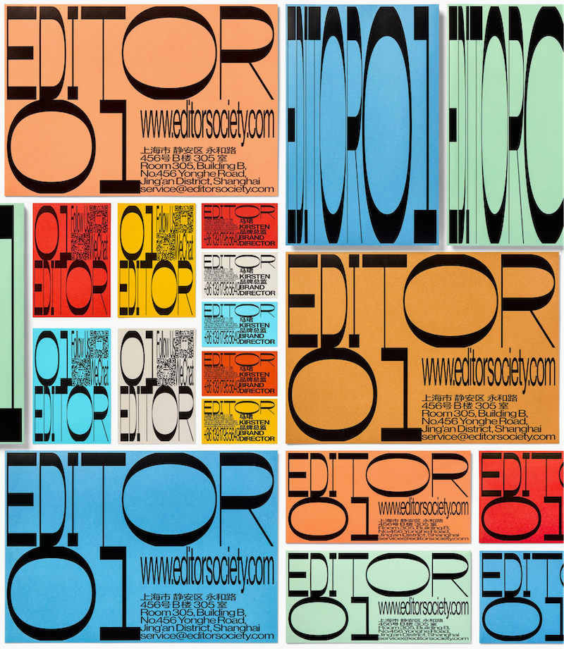 Guang Yu & Nod Young. Identity design for brand ‘EDITOR 01’. 2017. and retains a somewhat orderly fashion for commercial possibilities, with an advanced understanding of Chinese typography design
 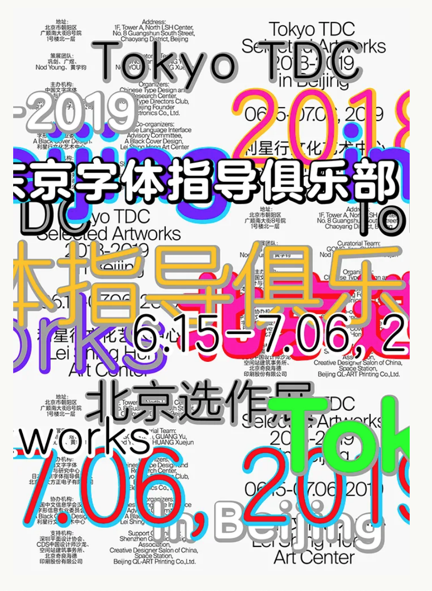 Guang Yu & Nod Young. Poster for TDC Tokyo Selected Artworks in Beijing. 2019.. As observed in many commercial projects done by their studio, ABCD (A Black Cover Design), bilingual content is elegantly integrated with each other
 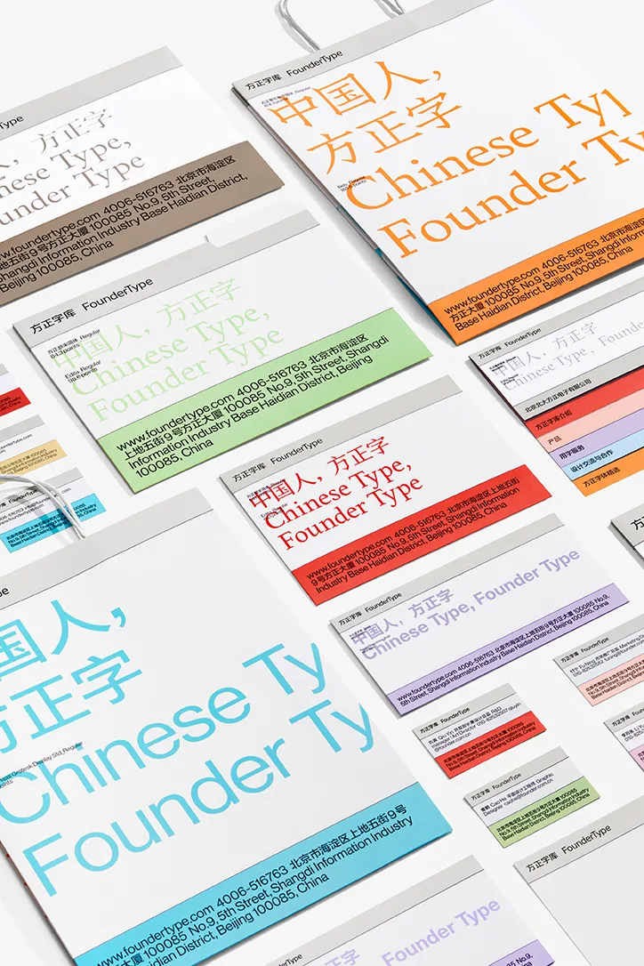 A Black Cover Design. Identity design for FounderType. 2019..1 Many design studios and individual designers, such as RCA alumni Can Yang
  Can Yang. Internal Alchemy Calendar. 2018., also form their unique methodology that embodies both Chinese and Western design philosophies.1
Official government propaganda has barely improved in terms of style or substance despite advancements in communication technology 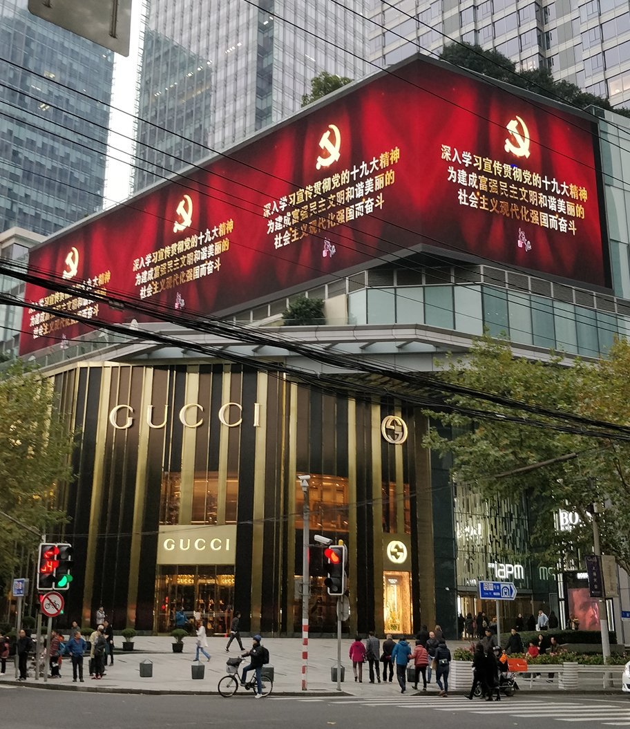 Tom Hancock. Photograph of a Gucci storefront underneath screens playing propaganda messages. Shanghai. 2017.. Maybe because the idea of utilitarianism from the Mao era still lingers; maybe a better art and design education still faces challenges from the immense population
 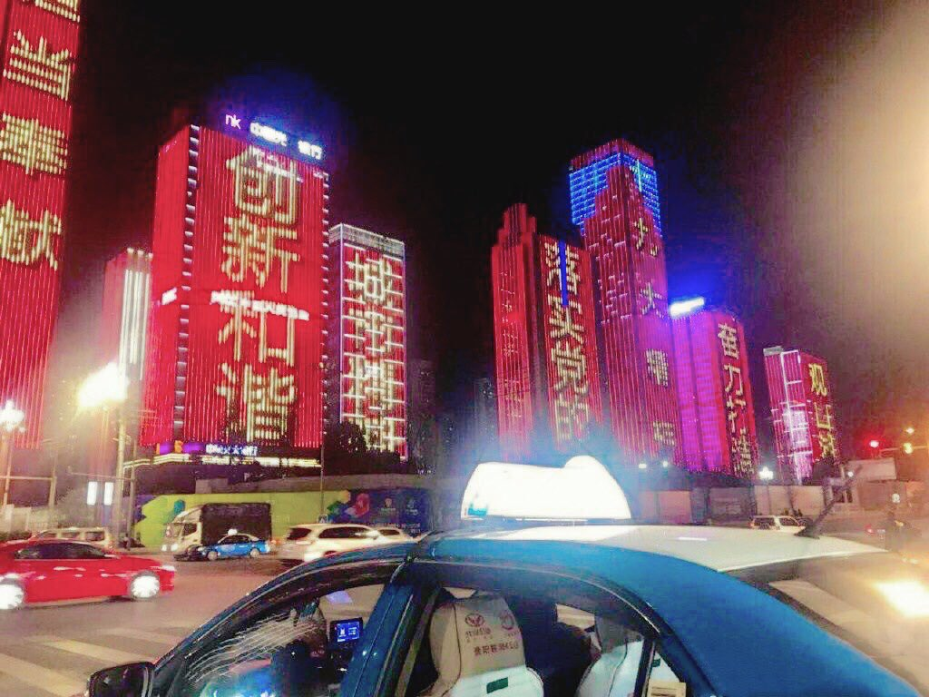 Propaganda slogans on illuminating buildings. Location and year unknown.. Perhaps both are true for a regime that values control over aesthetics amongst many, and the most disaffected rural population are simply the target demographic of traditional propaganda.
Although China’s graphic design has progressed significantly and gained international recognition, it is important to recognise that there exists a significant divide between the day-to-day design scene and the more academic or professional graphic design that was discussed in this series. This is discussed further in my full dissertation.
My current research only allows me to write until this point in history. As stated at the very beginning, graphic design, especially those not from Western countries, is very understudied. Yet, I cannot imagine a modern society without design. I hope this short project can inspire you to talk and write about design in your culture critically.
Jiarui Wang is a designer, artist, and writer. She is interested in diversifying the Western-centric graphic design discourse. Find out more about her practice on WWW.AZOTEJR.COM.


 china
china graphic design
 typography
 modernism
 decolonisation
 dissertation
